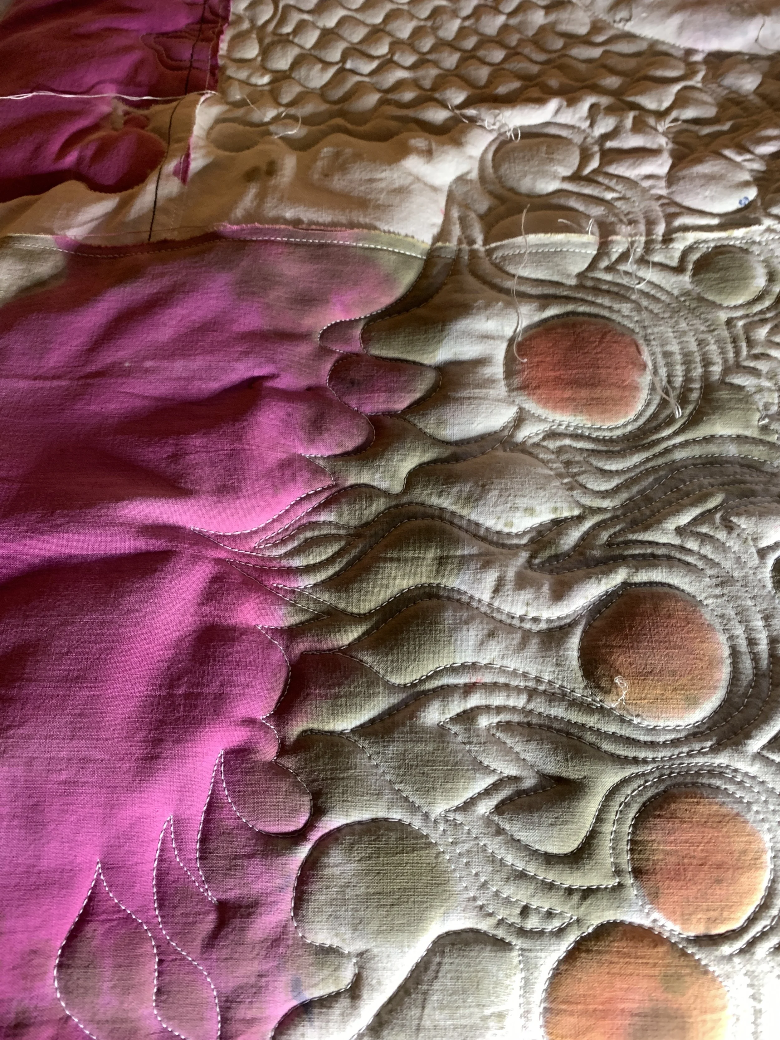
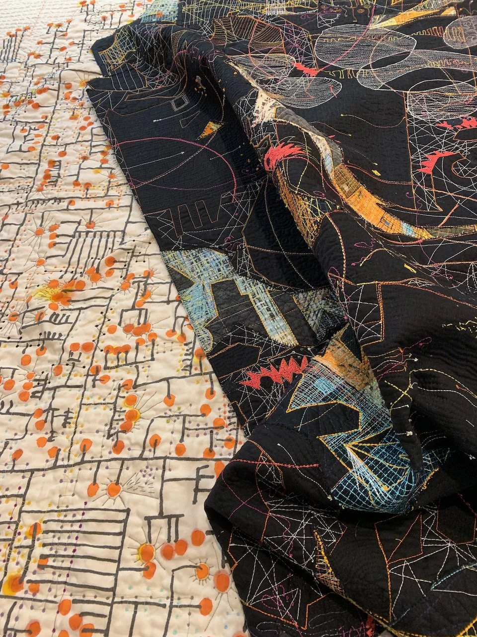
I have spent the last year and a half experimenting with different website layouts. My provider, Squarespace, announced new templates to choose from last year. I played around with them and was mightily confused about how the tools worked. So I abandoned the project. Then, about a month ago, they announced a new interface for the tools and I was encouraged to try again. The new templates allow for bigger images and the pages change based on what type of screen you are using. It wasn't as fun as I expected, very challenging, but worth the exercise... I think. You are seeing the results of that effort now. And I don't think I can turn back. There are probably bugs that I haven't noticed, navigation that is different, and a new feature for a newsletter subscription. Join up by going to the contact page to see what I might come up with in the future. And let me know if you see anything that is not working or spelled wrong.
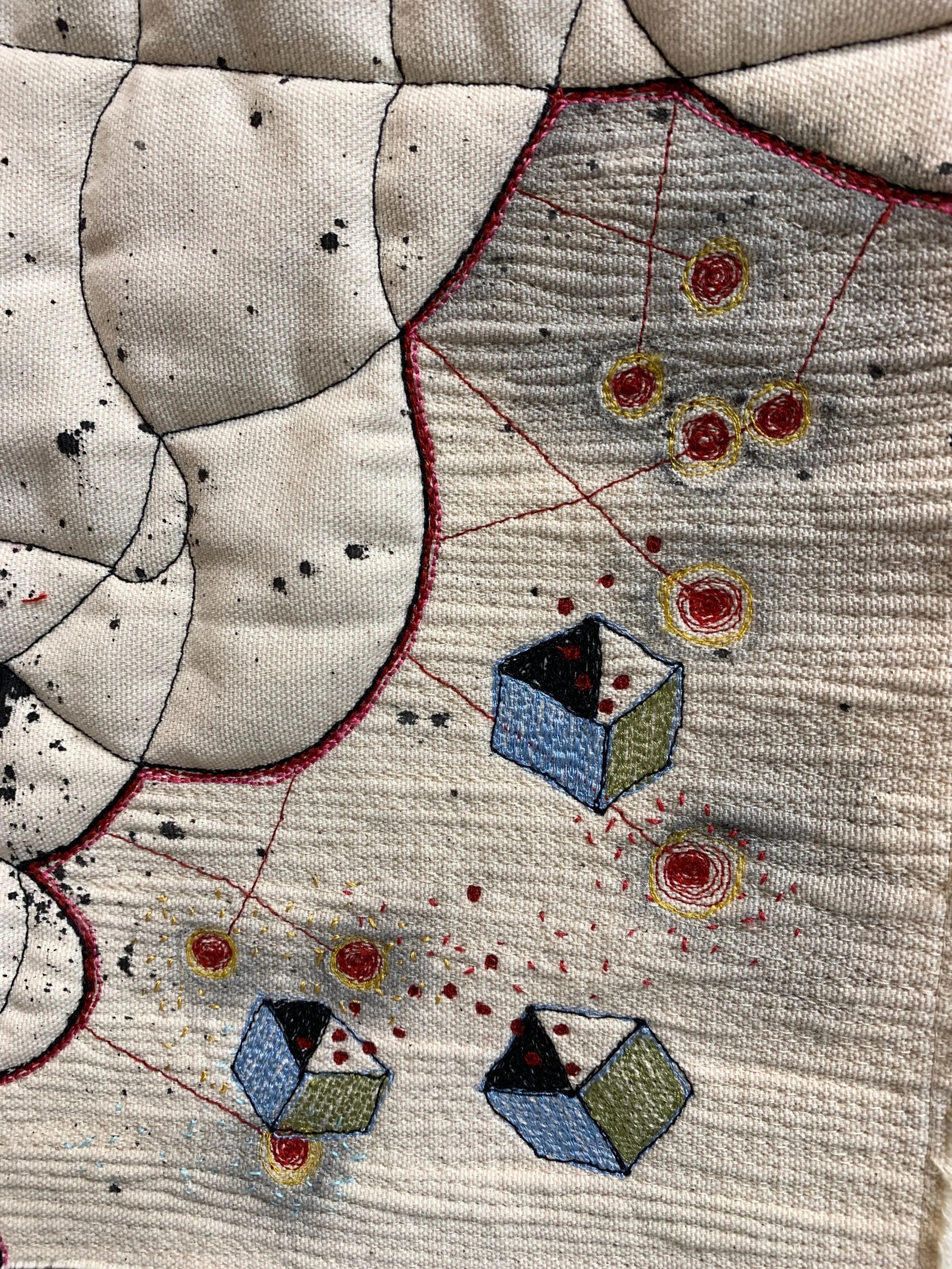
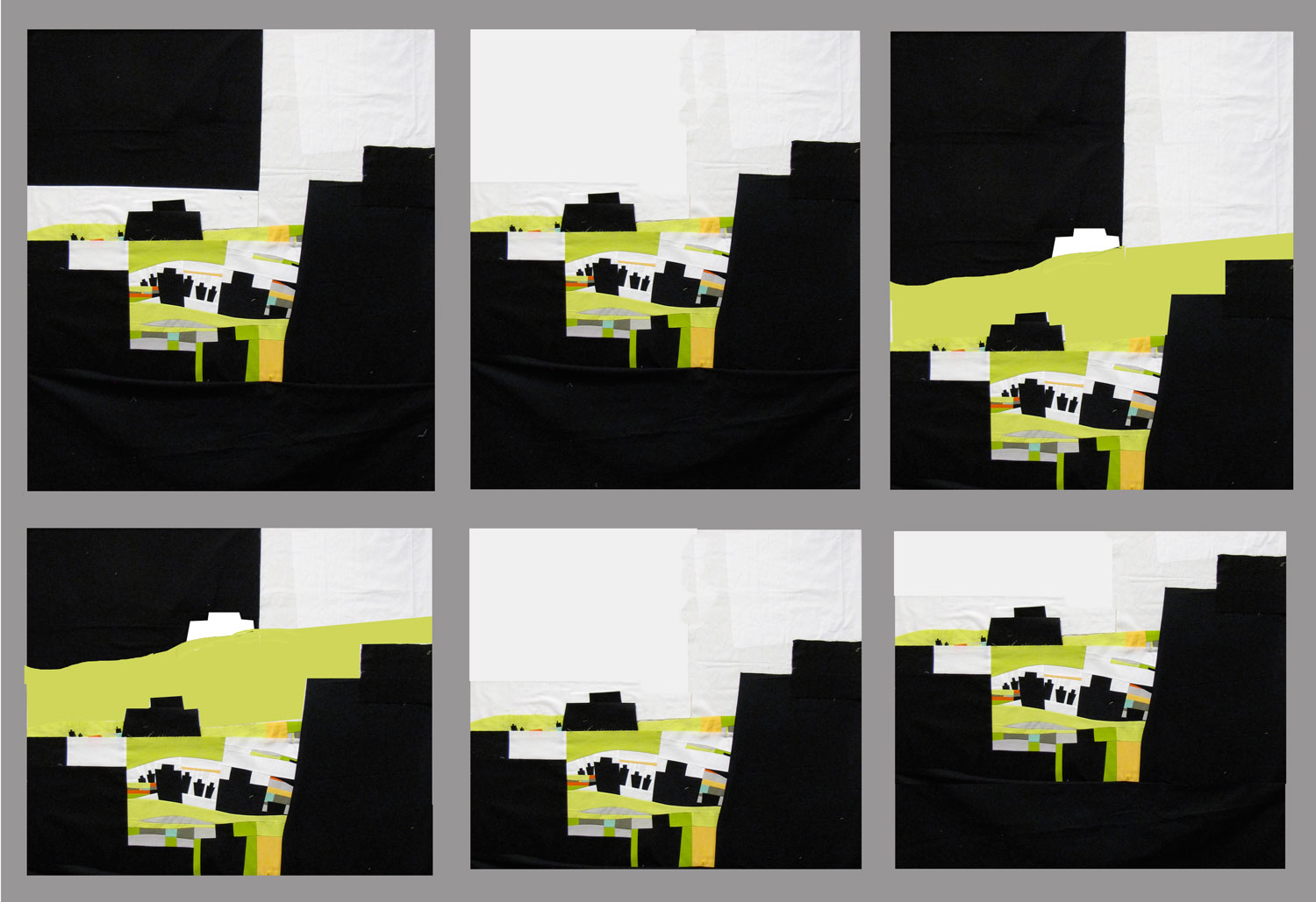
Meanwhile, back at my design board, I worked on this piece yesterday coming up with six variations that I am considering. The piece started as a focus on immigration, changed to refugees and now might be better titled...followers. I snapped a pic of the current layout (upper left) then using Photoshop, I experimented with a number of compositions seen here. Not sure yet which I will pursue. If you have a vote, let me know!


